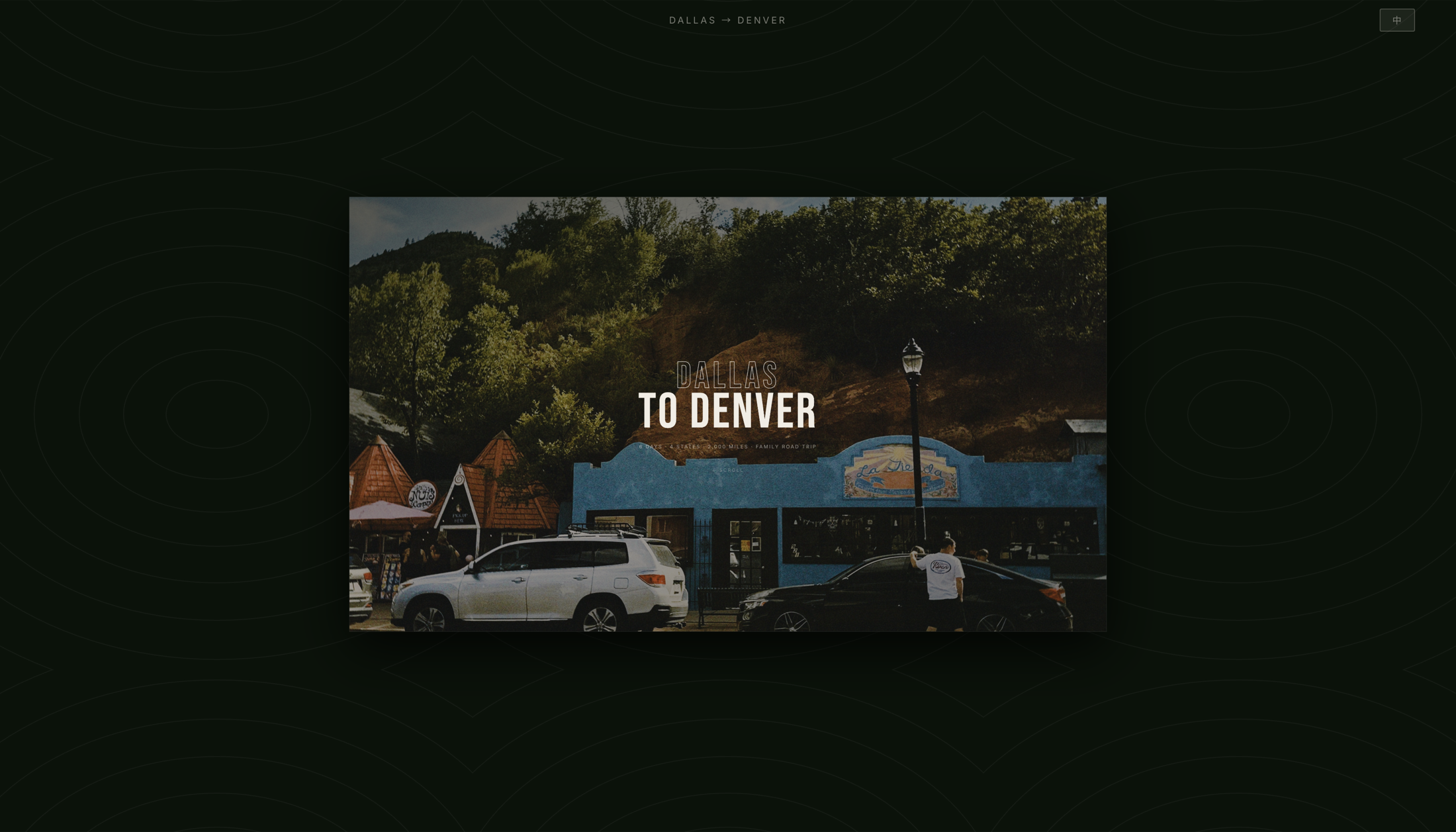
01 · Hero — Landing Page
Can a guide built for one family's 2,000-mile drive hold up as a public product — without losing the warmth that made it work?
THE QUESTION THIS PROJECT ANSWERS
I drove this route first — six days from Dallas to Denver, four states, 2,000 miles of canyons, volcanoes, mountain passes, and open plains. When my family saw the trip, they wanted to make the same drive themselves. So I came home and turned everything I'd learned on the road into a guide they could actually use.
It began as a private, Chinese-only planning tool for them. Then I rebuilt it for a wider audience: a bilingual Chinese/English toggle, a proper navigation system, and visual refinements that pull it closer to a real travel editorial — turning a family handoff into something that could stand on its own as a public product. As I write this, my family is preparing to leave, following the route through the site itself.
01 · Hero — Landing Page
A road trip guide carries a lot of information — routes, stops, food, notes, checklists, photography — and it needs to be scannable on the go, not just readable at a desk.
The original version was Chinese-only, intended for family. Expanding it meant translating not just language but design intent: keeping the warmth and personal detail of a family guide while making it readable and credible to a general audience.
Key constraints: single-page (no routing), no frameworks, real trip photographs, and a language toggle that persists across sessions.
Already trusts the source. Reading fast, usually mid-drive or at a rest stop — needs today's route, food, and checklist in seconds, not a pitch for why the site is credible.
Has no relationship with the trip yet. Needs the guide to earn trust first — through real photography, clear structure, and editorial polish — before they'll take the itinerary underneath seriously.
The accordion pattern for day entries solves the density problem — everything is accessible, but only one day is open at a time. The hero SVG map gives immediate spatial orientation before any scrolling happens. For a reader checking tomorrow's route from a phone at a rest stop, this means finding what they need without scrolling past five other days first.
Rather than two separate pages, a single language state governs both static HTML elements (via data-zh / data-en attributes) and dynamically rendered JS content. Language preference persists via localStorage. For family members who read fastest in Chinese and public visitors who don't read Chinese at all, neither has to fight the interface to get information in the language they actually think in.
Warm paper tones, editorial typography, and real photography keep the site feeling personal and travel-authentic — not like a generic template. The route SVG was hand-crafted to match actual geography. For a stranger with no prior trust in the source, this tone is often the first — and fastest — signal of whether the guide is worth their time before they read a single itinerary.
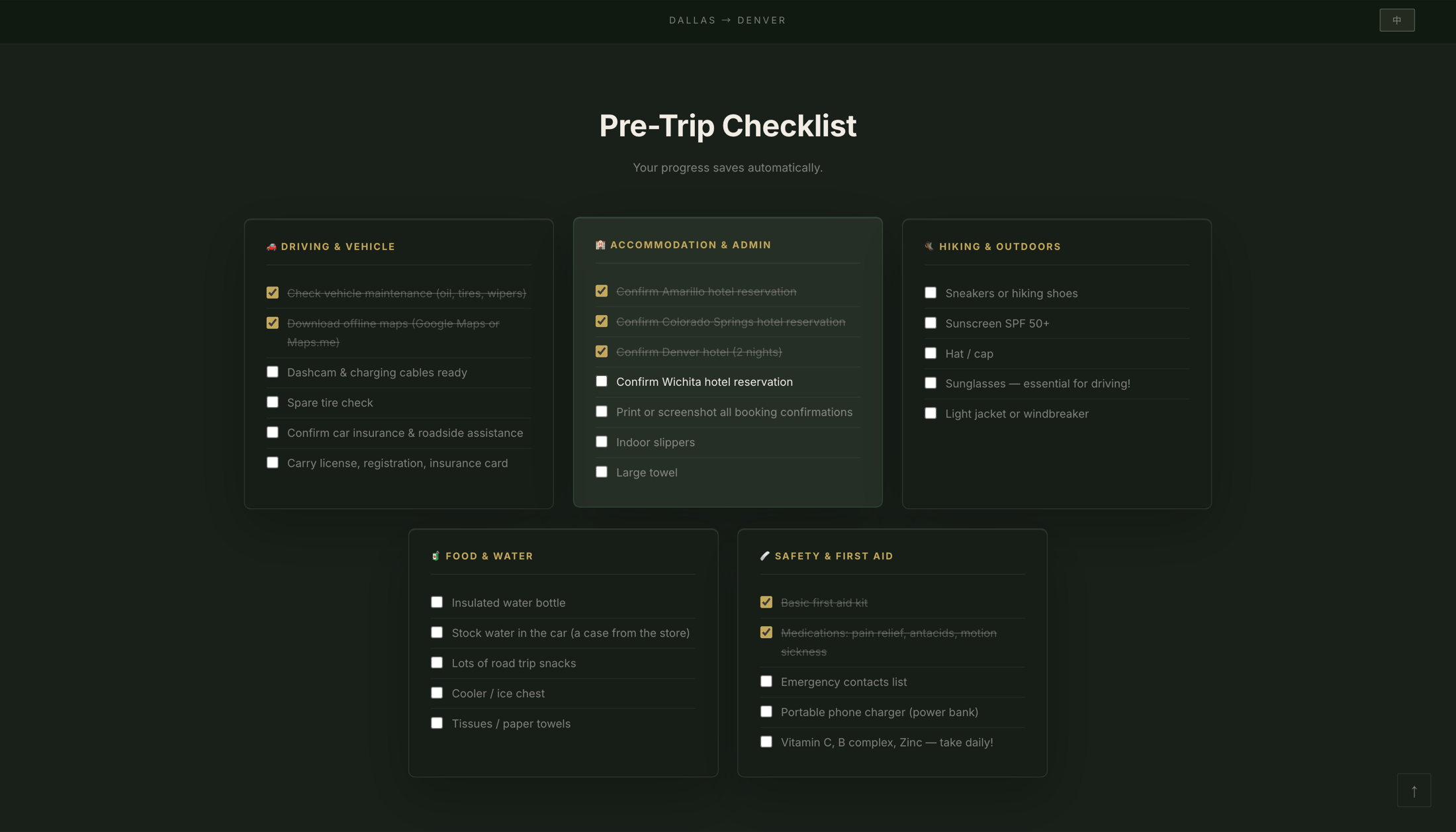
02 · Pre-Trip Checklist
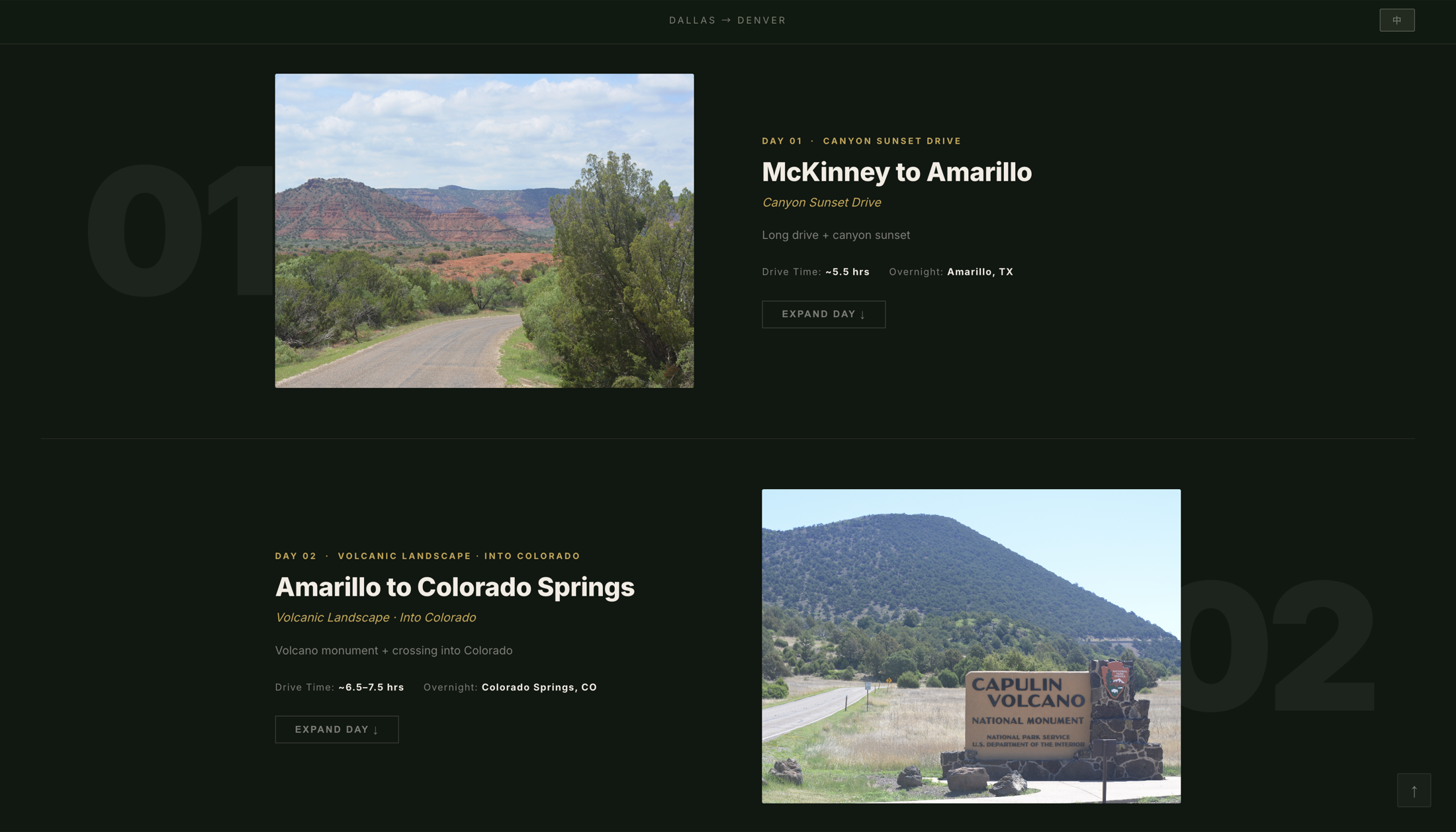
03 · Day Log — Journey Pages
This project never ran a formal usability study — its evidence is more direct than that. Every route, stop, meal, and timing in the guide comes from a trip I actually drove, not from research pulled together online.
And it's already being used for its real purpose. After seeing my trip, my family decided to make the same drive — and as I write this, they're preparing to leave, planning the whole thing from this site. The real test of this design isn't a lab. It's whether it can carry a real family from Dallas to Denver.
Building this site without a framework forced me to think carefully about state management — the language toggle needs to coordinate between HTML attributes, JS-rendered DOM, and localStorage without any reactivity library to help.
It also reinforced how much visual weight real photography carries. Even with a well-structured layout, the site only comes alive once the actual trip images are in place. Design and content are inseparable.
The biggest design insight: the audience shift from family to public required almost no content change — just tone, structure, and the removal of inside jokes. Good information design is already audience-agnostic.
The evidence here is real but narrow — one route I drove, one family about to follow it. The guide is grounded in a real trip and in active use for planning, but it hasn't yet been stress-tested on the road by anyone but me, or across different families' habits, devices, and trip styles.
The most useful next step is already lined up: once my family makes the drive, I'll be able to see where the guide actually helped and where it fell short under real conditions. Beyond that, I'd want structured feedback from a few other households planning their own trips, and I'd test the bilingual toggle with someone who reads only one of the two languages fluently, to see if the switch is ever a moment of friction rather than a convenience.
Live Project